

Jewish Federation of Louisville
![]()
![]()
Preferred (Horizontal) Vertical
Download the Federation Logo Package here
The Jewish Federation of Louisville is the resource development arm of the JCL. It maintains its own branding separate from the JCL. Consistent use of this logo makes the brand more recognizable and strengthens our presence in the community and links our community to Federations across the country and the Jewish Federations of North America. It should be displayed prominently on every Federation branded publication and other forms of communications.
Mark and Logotype
The core elements of the logo are the mark and The Jewish Federations of Louisville logotype.
When centered, center both the mark and the logotype
When horizontal, place the mark on the left.
Use the logotype only with the mark.
The mark may be used alone.
Always reproduce the mark and logotype from a digital master reference. Do not redraw or digitally manipulate either.
File Formats
Master files are available in eps, jpeg and gif format. Ensure the appropriate artwork format is used. These files can be downloaded from www.jewishlouisville.org/logos.
eps: all professionally printed applications
jpeg: desktop publishing programs
png: online usage
Accessibility
Always use good contrast with the background to ensure maximum impact and accessibility. Use sufficient clear space around the logo. It may not be overprinted on a photo or patterned background.
Color
The full-color logo has two distinct blue colors that were chosen for their traditional Jewish association. They are optimistic, warm and approachable. The Pantone Matching System (PMS) colors for printing are: lighter blue — PMS 2995 (90c, 11m, 0y, 0k) and darker blue — PMS 302 (100c, 25m, 0y, 50k).
Use the full-color logo when printing with two or more colors and online. In cases when only one color is required, a two-tone variation of PMS 302 or black should be used. When used on black background, the two-color option of white and PMS 2995 is preferable. The all-black and all-white (knock-out) versions are permitted, but should be used only when no other option is available. When possible, spot PMS colors should be specified with your printer. Do not match colors to this document or a computer screen. Refer to actual Pantone matching chips or screen color values, using the numbers listed as reference.
Size
To retain legibility, the logo should be at least 2″ wide. For online applications, the logo should never be smaller than 144 pixels wide.
Limited Space
When the logo has to be reduced to a minimum size, but there is not enough space to display the logo horizontally, the centered logo for limited space should be used. It should never be smaller than .75″ wide.
Clear Space
To ensure that the logo is always clearly reproduced and never obscured or compromised by other design elements in a layout, an area of clear space must surround it. The amount of clear space around the logo should be equal to the height of the flame in the middle of the mark.
Incorrect Usage
- Changing the placement of the mark.
- Using the logotype without the mark.
- Changing the color of the flame.
- Changing the color of the logo to any color that is not specified in this guide.
- Placing the logo on a background that is too close in tone.
- Changing the font of the logotype.
- Changing the alignment of the logotype and or the mark.
- Adding any elements into the logotype and or the mark.
- Changing the alignment of the lines in the logotype.
- Breaking the logotype into multiple lines.
- Superimposing the logo over a photograph.
Agencies receiving an allocation from the Federation Annual Campaign
All agencies receiving an allocation from the Federation Annual Campaign should acknowledge that support on their websites and printed materials. Co-branding with our partner organization gives those in the community a sense of what the Federation does with money raised during the Annual Campaign and helps make the Federation brand more visible. It also reinforces the partner organization’s connection with the community, conveying the message that the agency and the Federation work together for the good of the community.
When noted in copy, please refer to allocations as “Supported by The Jewish Federation of Louisville.” If used as a stand-alone or if listed with other sponsors please use either the horizontal or vertical logo (available for download at www.jewishlouisville.org/logos).
Download the Federation Logo Package here
Jewish Community Center of Louisville

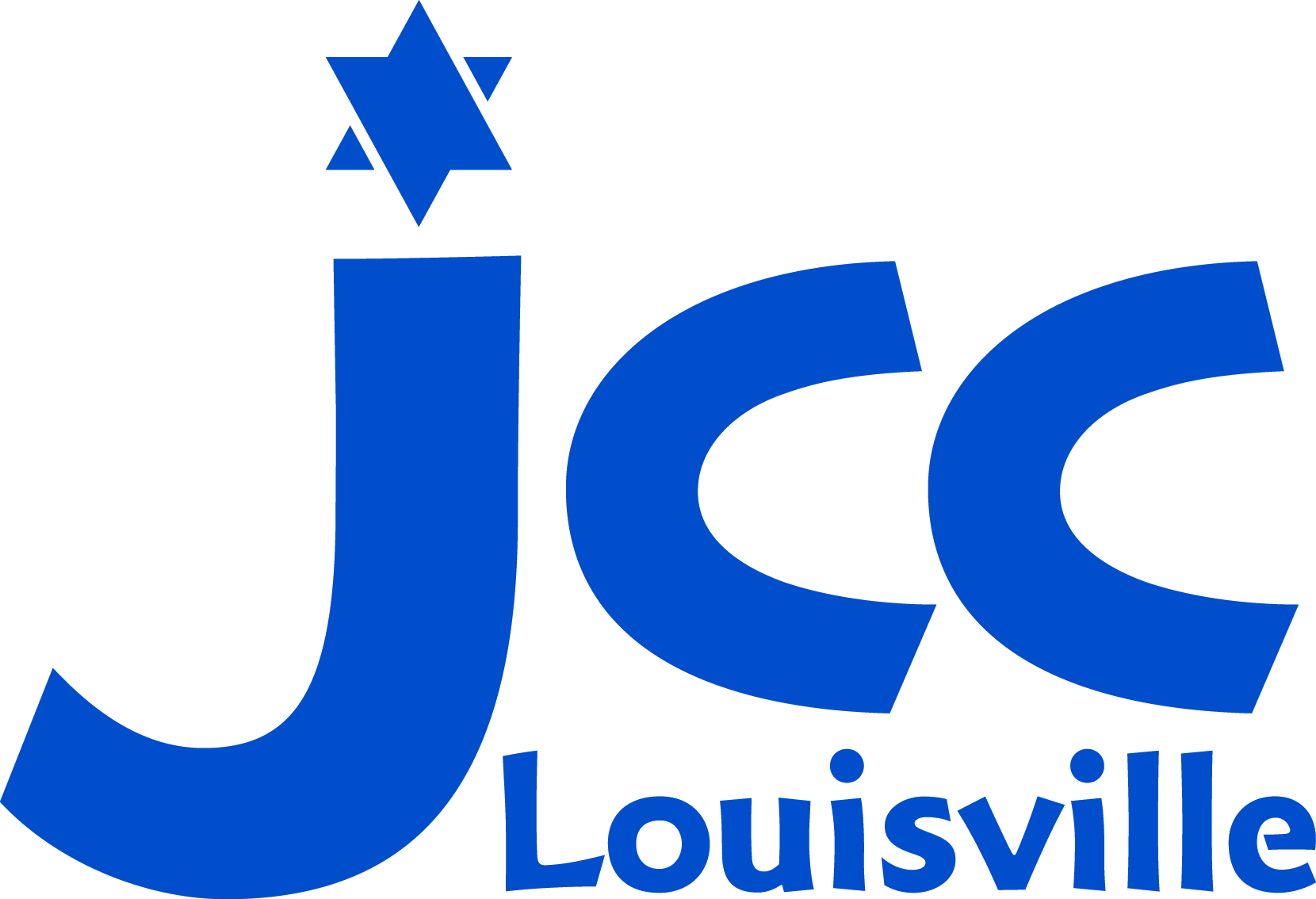
Preferred colors of the JCC
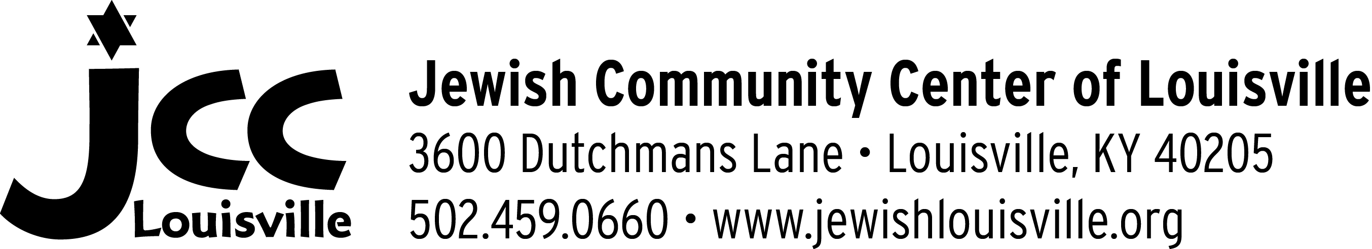
Mark with Logotype
Download the JCC Logo Package here.
The Jewish Community Center of Louisville (JCC) is the programming arm of the JCL and also maintains its own branding. Consistent use of this logo strengthens the JCC brand in the market. It should be used on every piece of JCC publications and communications.
Mark and Logotype
The core elements of the logo are the mark and The Jewish Community Center of Louisville logotype.
Only use the logotype with the mark.
The mark may be used alone.
Always reproduce the mark and logotypes from a digital master references. Do not redraw or digitally manipulate either.
File Formats
Master files are available in eps, jpeg and png format. Ensure the appropriate artwork format is used. These files can be downloaded from www.jewishlouisville.org/logos.
eps: all professionally printed applications
jpeg: desktop publishing programs
png: online usage
Accessibility
Always use good contrast with the background to ensure maximum impact and accessibility. Use sufficient clear space is required around the logo. It may not be overprinted on a photo or patterned background.
Color
The JCC logo is designed to be one color. PMS 315 (100c, 0m, 12y, 43k), PMS 653 (100c, 62m, 0y, 20k), 100% black or 100% white. The full color logo is preferable when printing with two or more colors and online. When possible, spot PMS colors should be specified with your printer. Do not match colors to this document or a computer screen. Refer to actual Pantone matching chips or screen color values, using the numbers listed as reference.
Size
To retain legibility, the logo should be at least 1/2″ wide. For online applications, the logo should never be smaller than 50 pixels wide.
Clear Space
To ensure that the logo is always clearly reproduced, and never obscured or compromised by other design elements in a layout, an area of clear space must surround it.
Download the JCC Logo Package here.
Jewish Community of Louisville
![]()
![]()
Centered (Preferred) Horizontal
Download the JCL Logo Package here.
The Jewish Community of Louisville (JCL) logo represents the agency as a whole. Publicly the JCL is better known by its department brands including the Jewish Federation of Louisville and the Jewish Community Center of Louisville. Use the JCL logo only when discussing the entire JCL e.g.: the JCL Board of Directors, JCL staff, JCL Planning and Allocations process. When referring to a specific department or program of the JCL, use the branding specific to that part of the agency.
Mark and Logotype
The core elements of the logo are the mark and The Jewish Community of Louisville logotype.
When centered, center both the mark and logotype.
When horizontal, place the mark left
Use the logotype only with the mark.
The mark may be used alone.
Always reproduce the mark and logotype from a digital master reference. Do not redraw or digitally manipulate either.
File Formats
Master files are available in eps, jpeg and png format. Ensure the appropriate artwork format is used. These files can be downloaded from www.jewishlouisville.org/logos.
eps: all professionally printed applications
jpeg: desktop publishing programs
png: online usage
Accessibility
Always use good contrast with the background to ensure maximum impact and accessibility. Use sufficient clear space is required around the logo. It may not be overprinted on a photo or patterned background.
Color
The full-color logo has two colors, a yellow and a blue. The Pantone Matching System (PMS) colors are PMS 131 M (9c, 37m, 100y, 0k), PMS 653 C (99c, 75m, 13y, 2k) and 100% Black.
It is preferable to use the full-color logo when printing with two or more colors and online. In cases when only one color is required, an all-black or all-white version is acceptable. When possible, specific spot PMS colors with your printer. Do not match colors to this document or a computer screen. Refer to actual Pantone matching chips or screen color values, using the numbers listed as reference.